The Ultimate Guide to Graphic Design for Large Format Print
0Introduction
Graphic design for large format print is not as straightforward as you might think. Unlike when you create artwork for brochures or websites, large format requires a keen eye for detail.
Keeping up with the constantly changing trends in graphic design is hard enough without having to change your style to suit the format or purpose of your artwork. But there are some simple techniques that you can use to make sure your skill shines through.
When your large format project is completed it is going to be big. That gives you no room for error. Would you want your mistakes, misalignments and poor quality imagery blown up for the world to see? There are certain steps that you must take when designing graphics for large formats.
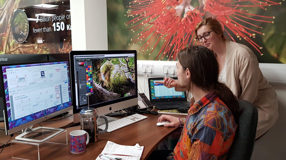
Leading exhibition stand designers, Quadrant2Design, know all about graphic design for large format print. Over twenty years of business, Quadrant2Design have had to be increasingly selective when it comes to hiring their in-house graphic designers. Large format print is essential to stand out on the trade show floor, but what is it about this type of graphic that makes it particularly difficult to design?
What are Large Format Graphics
What makes a large format graphic different from a standard graphic is its size. Obviously, it is large. When we talk about graphic design we often discuss magazines, websites, brochures and posters. However, large format graphics are becoming increasingly popular.
Businesses of all sizes love using large graphics in their marketing and advertising. The reason for this is simply because the bigger your signage is the more likely your target audience will take notice. There is no limit to your imagination when you think about large format. You have more space to create eye-catching displays or showcase your brand and message.
Large format graphics are necessary to create products like:
- Billboards
- Bus Advertisements
- Custom Floors and Ceilings
- Point of Sale Displays
- Trade Show Signage and Exhibition Stands
Although there has always been a need for large format graphics, the availability of large format printers has led to an increase in demand. As more brands, including SMEs and start-ups, choose large formats that help them stand out and be seen, there is an ever-increasing need for graphic designers that possess this skill.
What makes them different?
You might think that there is little or no difference when it comes to graphic design for small or large formats. That’s not the case. As well as creating visuals that align with the purpose of the design, the graphic designer must consider what the finished product will look like. Looking at an image on a computer screen or on a sheet of paper is one thing, knowing what the final result will look like is another.
Large format graphics require a keen eye for detail. Unlike standardized graphics, large format graphic design is dependent on an understanding of print and pixelation. If you take an image and enlarge it, the quality will deteriorate as it becomes pixelated and stretched. Designing graphics to withstand this process, without affecting the quality, is what makes graphic design for this format such a sought after skill.
Quadrant2Design’s in-house graphic designers specialize in this format. They design over 600 custom modular exhibition stands every year, and are fortunate enough to work with large format printers so their team sees each product through from beginning to end.
If you’ve got a project that requires large format graphic design, then you don’t need to panic. Quadrant2Design have given you their top tips to make sure any project you’re working on runs smoothly.
Use the Best Software for the Job
There are a lot of great free Mac applications that we recommend to graphic designers. Photoshop is also a great tool, there is no denying its use when it comes to graphic design. However, we don’t think that it’s the best tool when it comes to large format print.
Choosing the right software is crucial to creating dynamic, seamless large format graphics. We don’t use Photoshop to create any of our exhibition stand graphic panels. The file sizes become huge, taking up too much space on our server. The software doesn’t set up for print, meaning the results are unreliable. Colour management along with managing vectors is a nightmare. The entire project risks looking like a dog’s dinner.
The majority of exhibition stand design will be done using Illustrator or InDesign. We use InDesign because it makes it easy to set documents up for print, seamlessly integrate vector and raster imagery and use RGB and CMYK color modes alongside one another.
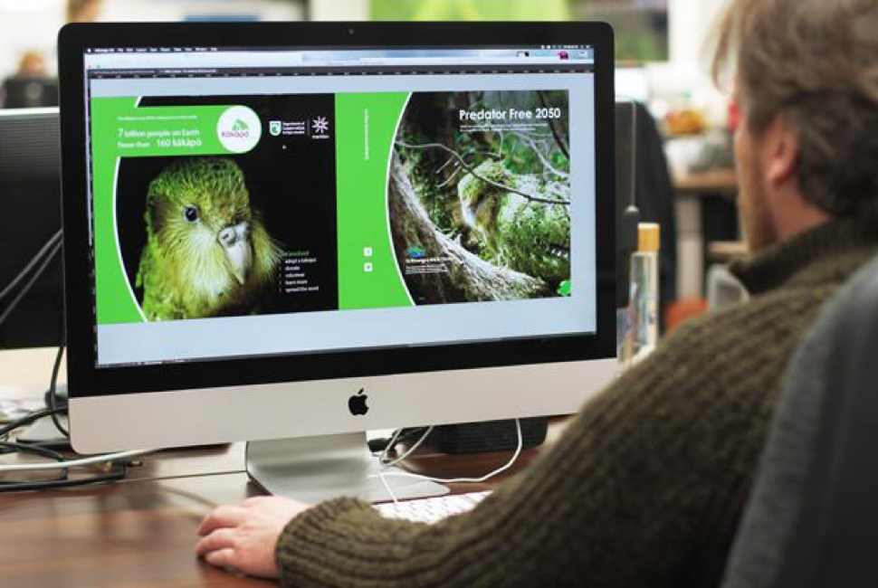
Another benefit of InDesign is that it populates your design with low-resolution previews of your imagery or vectors rather than holding large, heavy files. As any graphic designer knows, this can quickly kill even the best MAC or PC.
You can use more than one program to create your graphics. It is definitely worth creating your complex vectors in Illustrator and editing your imagery in Photoshop before you load it onto InDesign. But our advice will always be to trust InDesign when it comes to designing large format graphics.
Work at ¼ size
When you are producing graphics that are meters long it simply isn’t necessary to work at full size. Graphics this large will create huge file sizes, inevitably leading to computer crashing and loss of work. Furthermore, file sizes this large are difficult to share with clients and other members of the team for review.
There is no need to work with files this size. We recommend scaling down to ¼ of the size. Yes, it requires a little bit of maths (dividing everything by 4) but the benefits of working to this scale far outweigh the negatives!
When scaling be mindful of human error. It happens. We know it happens. Just ensure people are double-checking their calculations and have a second pair of eyes look over each design to minimize the risk.
Secondly, be crystal clear when communicating with your printers. The more you are able to tell them, the less room there is for error. Let them know what scale you’ve been working at and what size you want the graphic to be. Remember that large format printers run powerful software that can take correctly set up artwork and scale it up.
As a final step, if you want to check the end result, you can export the artwork as a PDF before you send it to print. By taking that PDF and zooming in 400% you will get a good representation of the quality the large format print will be.
Get your Image Quality perfect
Great Quality to Start With
You need to start with good quality images to start with when it comes to large format print. There is no point in relying on your website imagery or something forwarded from a smartphone. There is always going to be scaling when it comes to this type of artwork, so give yourself the best starting point by only using high-resolution imagery from the beginning.
Output resolution
Deciding which output resolution you want to use is a critical step in the process. Your output resolution will depend on the type of large format print and how it is intended to be viewed. In the exhibition industry, the standard is 75 dot per inch (DPI). This is because exhibition stands are viewed at a distance of 1m or more. If you are designing point of sale displays or billboards your DPI will be different.
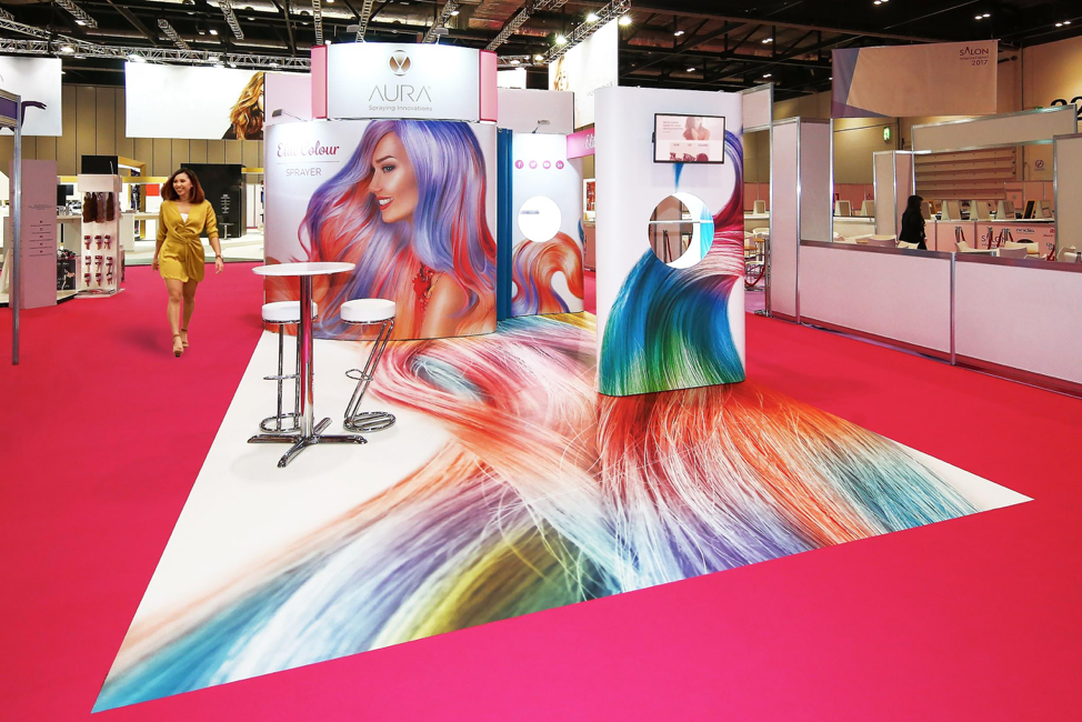
Remember your scaling. If you are sending your artwork to print at 75 DPI and have used a ¼ scale, then you will be working with 300 DPI.
Scale to suit the artwork
Although we love InDesign, and use it for all of our exhibition stands, our advice is to never let the software handle the scaling of your imagery for you! The quality of your artwork will plummet. If you need to scale the original image up, then do it in Photoshop. Photoshop uses very clever tools to scale up images, which reduces the overall effects of scaling. InDesign hasn’t quite achieved this yet.
What InDesign is great at, however, is showing you the actual DPI of an image and the effective DPI of the final result. If the image is 100% in scale, then both numbers will be the same. If your imagery is scaled up then the effective DPI will drop and vice versa.
Vectors
Vector graphics are ideal for printing. They are digital images that are formed through a sequence of commands or mathematical equations. These equations can translate from software to software, and even when they are sent to print. What this means is that you can completely remove scaling from the equation, and won’t face any loss of quality when it comes to large format printing. When compared with raster graphics, vectors will produce a much higher-resolution finish.
By using vectors for as many elements as possible you will stand a better chance at producing a high quality finish to your artwork. Anything that isn’t photography, or complex montaging that can only be created using Photoshop, should be done this way. This includes, but is certainly not limited to, logos, icons, text, block colours and gradients.
Accuracy is King
There is no room for error when we talk about large format graphic design. Your artwork is going to be BIG. That means that any tiny inaccuracy or misalignment will also be BIG. When working at a ¼ scale you should expect all of your imperfections to become magnified, meaning even the slightest misalignment will be noticable. A fraction of a millimeter on screen will translate to a few centimeters once printed, so make sure that you are using the best alignment tools and sticking to the coordinate system.
Smart guides are the bane of existence when it comes to large format graphic design. It might seem like a fantastic idea to automatically snap elements together. The problem is that you can never be certain of which elements are snapping with which. If you are working on a complex piece of artwork smart guides can become a lottery. To ensure you are producing highly accurate large format graphics, we recommend avoiding this tool altogether.
Summing Up
One of the biggest differences when working with large formats is the cost to print and produce the artwork. It certainly isn’t cheap. Especially when compared with your average brochure or graphic design job. That is why it is crucial to check your work, with exceptional detail, before it gets sent to print. This is the only way to avoid the biggest graphic design pitfalls!
By following the five steps outlined above you’ll be able to produce great artwork. But keep an eye out for spelling errors, incorrect alignment, old/incorrect versions of artwork and completely missing elements to make sure that your large format graphic design project has the best finished result.

